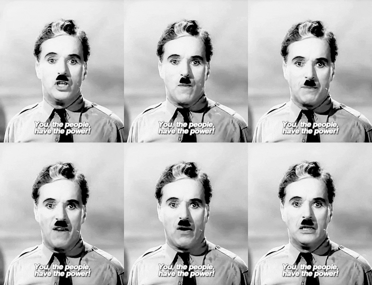

This is what I came up with. I'd like to know what you think. Please feel free to be as honest as you like, but I am trying to get constructive criticism here, not just Sazari telling me "lil breh, you suck at Photoshop." Because I do. Still, this theme is easy to do and unique enough that it might get noticed, and it won't require me hiring a graphic artist.
Please note that I've removed the contact information that sits right at the bottom of the page, in large, bolded font. For obvious reasons.
What do you think of the theme?
Would it catch your attention amidst other fliers?
Would you bother to read all of it?
Did you think it was funny, cute, stupid, annoying?
Is it easy enough to read, or does the amount of font variation make it illegible?
Thanks guys.